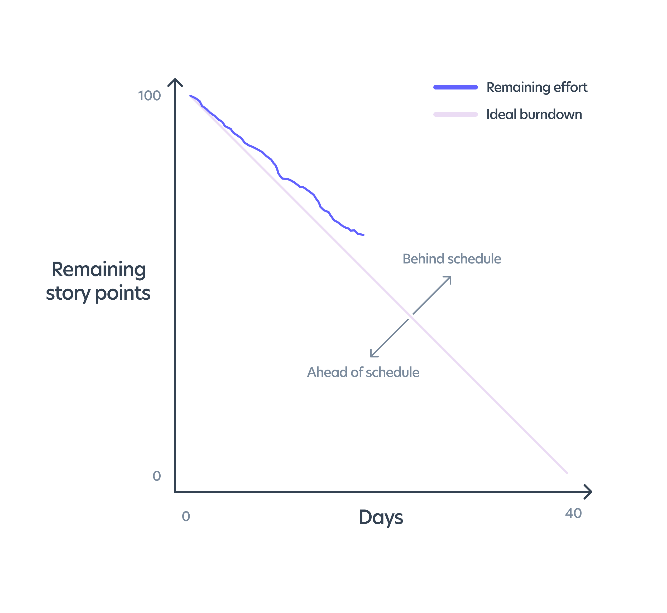
In Agile software development, there are a variety of reports to show progress both during and after a sprint: velocity report, cumulative flow diagrams, control charts, burnup charts, and the burndown chart. In Scrum in particular, the burndown chart ranks chief among all reports.
In its simplest terms, the burndown chart plots work remaining (y-axis) again time (x-axis). The chart thus effectively shows both work completed and work remaining at a glance without getting bogged down in details. The chart is used to visualize a team’s overall status and progress toward completing committed sprint work and achieving sprint objectives.

Here are four things to watch out for when viewing the burndown chart:
- Upward trend to the chart. This is an indication of scope creep. User stories have been added or story points have been adjusted. Sharp spikes up or down. This may indicate taking on excessively large stories that need to be broken down. It can also indicate inaccurate estimation.
- The line drops to near zero before the end of the sprint. This indicates the team is sandbagging or not taking on enough work during sprint planning.
- The line is relatively straight or otherwise well above the zero line at the end of the sprint. This usually indicates the team is committing to too much work during sprint planning.